Brand
The thinking behind Proof.
Make complex engineering understandable enough to act on, without hiding uncertainty. Our design guidance, approved descriptions and downloadable assets follow that purpose.
press contact hello@reqproof.com share card 1200×630 retired marks in the museum
Design intent
Give every detail a job.
Paper, ink, sage and serif type make room for a difficult idea. The visitor should understand what changed, what must remain true and what the evidence establishes.
Atmosphere creates interest.
A landscape or carefully made object can give the opening character. Keep that freedom. An explanatory diagram has a different job: make a relationship clear enough to follow.
Clarity preserves the limits.
Use normal ink for explanations and material gaps. Highlight the important words. Label actual captures, executed examples and proposed interfaces so their status is clear.
Dependencies
Name the objects and the connection: a requirement depends on another promise, or is verified by a check. Lines must explain a relationship.
Evidence
Put the observation beside the claim, with the revision checked. A historical pass stays historical when its basis changes. Stale, missing and failed mean different things.
Memory
Show which requirement, check or decision reaches the next change. Retained knowledge helps the next agent; it does not make old results current.
Authority
Keep draft intent, approved intent, evidence readiness and acceptance distinct. A passing check supports a claim within its scope.
A complete journey
Follow the same change all the way through.
This reading of our executed reservation-cache fixture shows why the requested edit and the preserved promise belong together. The requirement is draft and the dependency mapping was supplied by the author.
- 01 / Request
12-hour cache
Shorten the retention setting.
- 02 / Agreement
24-hour promise
A retry must return the original reservation.
- 03 / Reach
Reservation behavior
The cache affects whether a retry creates another reservation.
- 04 / Evidence
Two failing cases
Retries at 12 and 23 hours created a duplicate.
- 05 / Next change
Keep the obligation
Retain the requirement and run records. Check the next revision again.
Executed teaching fixture, 3 October 2026. Passing tests did not establish acceptance. Inspect the runs and remaining gaps ↗
A useful diagram answers a question.
A named requirement leading to an observed check explains the evidence. An unlabeled web leaves the visitor to invent the meaning. Define the takeaway before drawing.
Review the whole experience.
Ask a new reader to explain Proof, find a limitation, follow its source and start the next action. Then check mobile, keyboard use, loading and reduced motion. A clean screenshot is one part of that review.
These are standards for creating and reviewing our work. They are not a claim that every existing page already meets them.
01 · The mark
The P and the dot.
The browser icon is this file. It is the wordmark’s P and period, in the same face and colors as the header.

The icon file, assets/brand/proof-mark.svg, identical to /favicon.svg.
This icon is the wordmark’s P from Bricolage Grotesque at weight 800, in ink #24302a on paper #f3f0e9, with a sage #7fa34e period. It is the file browsers request. Do not recolor it.
- proof-mark.svgSVG · outlined, same drawing as the favicon
- proof-mark-512.pngPNG · 512 × 512
- proof-mark-1024.pngPNG · 1024 × 1024
02 · The wordmark
Live text, not a logo file.
The wordmark is the header’s own render, scaled up. What sits on the plate below is not an image; the stylesheet that draws the header draws it.
PROOF.
Rendered live by the header stylesheet. Bricolage Grotesque 800, ink #24302a, sage period #7fa34e.
Bricolage Grotesque at weight 800, set as PROOF. The letters take the ink #24302a. The period takes sage #7fa34e. The ground is paper #f3f0e9. The plate above is the header’s own text. The files are the same drawing, outlined, for a place that cannot set the live type. The previous phosphor wordmark is in the museum.
- proof-wordmark.svgSVG · outlined, 1320 × 498
- proof-wordmark@2x.pngPNG · 1320 × 498
03 · The name
How to write it.
Use the same name and describe the product precisely.
In prose
Proof, one word, capital P. Every page title here reads … · Proof; every sentence says Proof.
What Proof does
Proof connects software intent, engineering work and verification evidence. Its Software Intent Graph links requirements, dependencies, code, hazards, checks and change history. Describe an audit or assisted engagement as one way to use Proof.
The footer line
Proof · founded and operated by Leonid Bugaev. This identifies the founder without implying a team size, customer relationship or institutional endorsement.
Accountability
Name what ran, which revision it checked, what the result supports and who or which policy authorized acceptance. Describe human review when it actually occurred or the engagement requires it. Do not imply that every finding always receives manual review, or that a passing check grants permission to merge.
Set as the mark
The stylesheet renders the name as PROOF., with the period in sage. Written down, the name is still Proof.
ReqProof
The domain form. On this site it appears only inside domain and infrastructure names (reqproof.com, portal.reqproof.com, downloads.reqproof.com), never as the product’s name in a sentence. Write Proof unless you mean the domain.
04 · Boilerplate
The lines to quote.
Use a description at the length you need. Preserve the distinction between observed results, current product capabilities and the broader factory ambition.
Proof reduces the work between a software change and the evidence required to trust it.
Proof brings requirements engineering and verification into the coding agent’s workflow. It connects intended behavior, dependencies, checks and change history so people can inspect what a change establishes and what remains unresolved.
Proof is building an evidence-backed software factory for existing codebases. Its Software Intent Graph connects requirements to dependencies, code, hazards, checks and change history. Proof gives coding agents that context, evaluates evidence against revisions and retains the results for later work. Claims remain bounded by the checks performed, their scope and any unresolved decisions.
From prompt to production. Proof brings NASA-grade rigor for your AI workflow. Review the evidence. Spend less time reconstructing it.
Proof was founded by Leonid Bugaev.
“NASA-grade” refers to the engineering practices explained on the homepage, not NASA certification or endorsement. Press contact: hello@reqproof.com.
05 · Color
Six values carry the site.
These specimens use the page’s tokens. Sage directs attention. Ink carries the words. Pass and fail describe observed check outcomes and always need readable labels.
--paper). The primary reading surface.
--ink). Body copy, headings and wordmark letters.
--signal). The accent for the wordmark period and for a link under the pointer. Not a headline color.
--pass). A check passed within its stated scope.
--fail). A check that ran and broke.
Sage takes
The wordmark period, a link under the pointer, and a small kicker mark. Sage is an accent, not a verdict.
Sage never takes
Headlines or body copy. Those set in ink, #24302a. A button sets in ink on paper, or the reverse.
Verdicts
Pass is #6f9a48. Fail is #8a341f. Those two report what a check did. They are not the accent.
06 · Type
Headings, sentences, records.
The live site uses three jobs of type. The wordmark is its own face.
Headings. The stack is Iowan Old Style, Baskerville, Palatino, then Georgia. Weight 400.
Sentences and navigation. Variable, weights 300 to 700. The wordmark is Bricolage Grotesque at 800, not this face.
Labels, records, and code. Weights 400, 500 and 600.
07 · Do and don’t
Short, and meant.
Do
- Use the files as supplied. The SVG and the PNGs are the same mark; pick by medium, not by taste.
- Quote a boilerplate verbatim, or write your own sentence; anything between the two reads as ours without being ours.
- State what the image is. Date a real capture and preserve material gaps. Label a proposed interface or illustrative data beside the visual.
Don’t
- Don’t recolor the icon. Letters stay ink, the period stays sage, and the ground stays paper. The same file is the browser icon.
- Don’t set a headline in sage. Sage signs the wordmark period. Ink carries the words.
- Don’t restore the tube. The phosphor site is the previous served generation, kept in the museum.
- Don’t imply endorsement. A Proof mark near a product does not establish an audit or customer relationship. Link the dated public evidence supporting the specific claim.
08 · The share card
What a link unfurls.
This is the default share card. A page may supply a card about its own subject. Keep one readable idea, the supplied wordmark and a claim the destination actually supports.
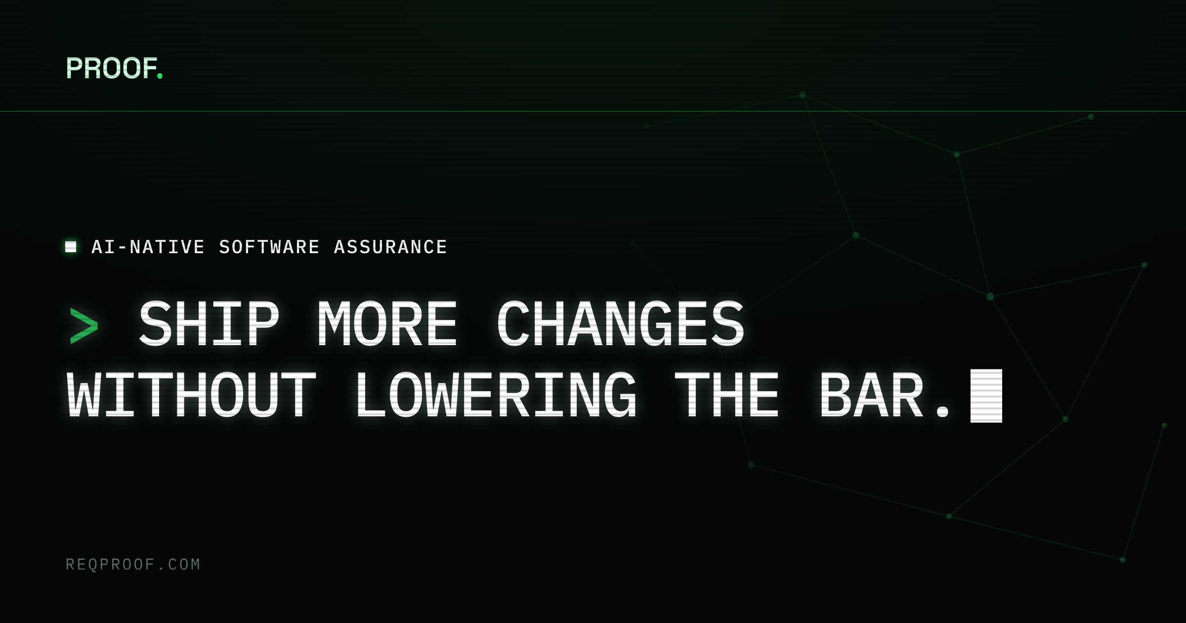
The default card carries the homepage line, From prompt to production. Pages that name their own subject keep their own card. The Audit card is assets/og/v10-audit.png. The previous phosphor card is the one archived with the served site in the museum.