Brand
Writing about Proof.
The mark, the wordmark, the name, the palette and the type, as shipped, with the files to download.Nothing on this page is aspirational. Every value is read from the live stylesheets, and the wordmark below is rendered by them.
press contact [email protected] share card 1200×630 retired marks in the museum
01 · The mark
The P and the dot.
The site’s favicon is the canonical mark, shown here at plate size. Use it as supplied; the SVG and the PNG renders are the same mark.

The mark, from assets/brand/proof-mark.svg · identical to /favicon.svg
The wordmark’s own P — the glyph outline from the site’s Space Grotesk file at weight 600 — in the phosphor ink #D2FFE2 on the tube ground #050807, signed with the wordmark’s period. The dot’s color is authored in display-P3, color(display-p3 .144 1 .174), and falls back to #2BFF6F on standard displays; the PNG renders carry the sRGB fallback. Do not recolor it; it brings its own tile.
- proof-mark.svgSVG · source, 32 × 32 viewBox
- proof-mark-512.pngPNG · 512 × 512
- proof-mark-1024.pngPNG · 1024 × 1024


02 · The wordmark
Live text, not a logo file.
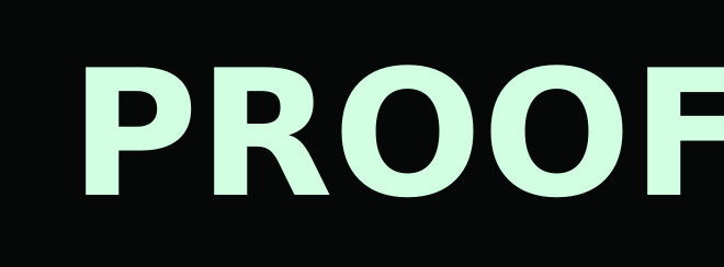
The wordmark is the header’s own render, scaled up. What sits on the plate below is not an image; the stylesheet that draws the header draws it.
Proof.
Rendered live by this page’s stylesheet · Space Grotesk 600, uppercase, letter-spacing 0
Space Grotesk at weight 600, set uppercase by the stylesheet with letter-spacing zero: PROOF. The letters take the phosphor ink #D2FFE2, the period takes the mark’s green — authored in display-P3, color(display-p3 .144 1 .174), falling back to #2BFF6F on standard displays; on the live header it is an HDR tile at 1000 nits — and the ground is the tube’s #050807. A raster wordmark was retired deliberately: a mark that is text cannot go stale.
- proof-wordmark.svgSVG · text + font stack, 660 × 244
- [email protected]PNG · 1320 × 488, set in the site’s own woff2
![[email protected]](assets/brand/proof-wordmark@2x.png)
03 · The name
How to write it.
Derived from how this site actually writes it, not from a naming policy.
In prose
Proof, one word, capital P. Every page title here reads … · Proof; every sentence says Proof.
The practice line
Proof · a practice run by Leonid Bugaev, the line the footer of every page carries.
Set as the mark
The stylesheet renders the name uppercase, PROOF., with the period in the mark’s green. Written down, the name is still Proof.
ReqProof
The domain form. On this site it appears only inside domain and infrastructure names (reqproof.com, portal.reqproof.com, downloads.reqproof.com), never as the product’s name in a sentence. Write Proof unless you mean the domain.
04 · Boilerplate
The approved paragraph.
One sentence, quotable as-is; it is the description the front page ships. One click selects the whole passage.
Proof turns what your software must do into executable requirements — a living graph of intent, kept true by a CLI that reruns evidence as the system changes.
Proof is a practice run by Leonid Bugaev, its founder and named principal.
Press contact: [email protected]. It reaches a person, not a queue.
05 · Color
Six values carry the site.
The chips are painted from the live tokens, so this page cannot disagree with the stylesheet it documents. One rule outranks taste: green appears only on verified state.
--paper). Every page sits on it.
--ink). Every sentence, and the wordmark’s letters.
--signal): links and buttons. White, so a control can never be mistaken for a verdict.
--pass). A check that ran and held — and the mark’s period, the one glyph that signs in this green off-state.
--fail). A check that ran and broke reads amber on the tube.
--pq-green): authored in display-P3, color(display-p3 .144 1 .174); this hex is its standard-display fallback. On the live header it also carries a 1000-nit HDR tile.
06 · Type
Two voices, no third.
Every piece of text on the site belongs to one of two layers.
The human layer: every sentence a visitor reads, and the wordmark. Variable, weights 300–700; the site speaks at 400 and 600.
The machine layer: labels, records, code, captions, and on this terminal theme the headings. Weights 400, 500 and 600.
07 · Do and don’t
Short, and meant.
Do
- Use the files as supplied. The SVG and the PNGs are the same mark; pick by medium, not by taste.
- Quote the boilerplate verbatim, or write your own sentence; anything between the two reads as ours without being ours.
- Screenshot the real thing. The site and the portal are public; a live capture beats a reconstruction.
Don’t
- Don’t recolor the mark. It ships with its own tube tile, the phosphor P and the green dot; on light grounds the tile does the work.
- Don’t use green for anything but verified state when quoting the UI. Green is the one reserved word in this design system.
- Don’t reach for the serif v7 mark. It is retired, and on display with every mark before it in the museum.
- Don’t imply endorsement. A Proof mark near your product does not mean Proof audited it; only the public register says that.
08 · The share card
What a link unfurls.
When a page from this site is shared, this is the card it offers.